
What a wedding photo app sign is actually asking guests to do
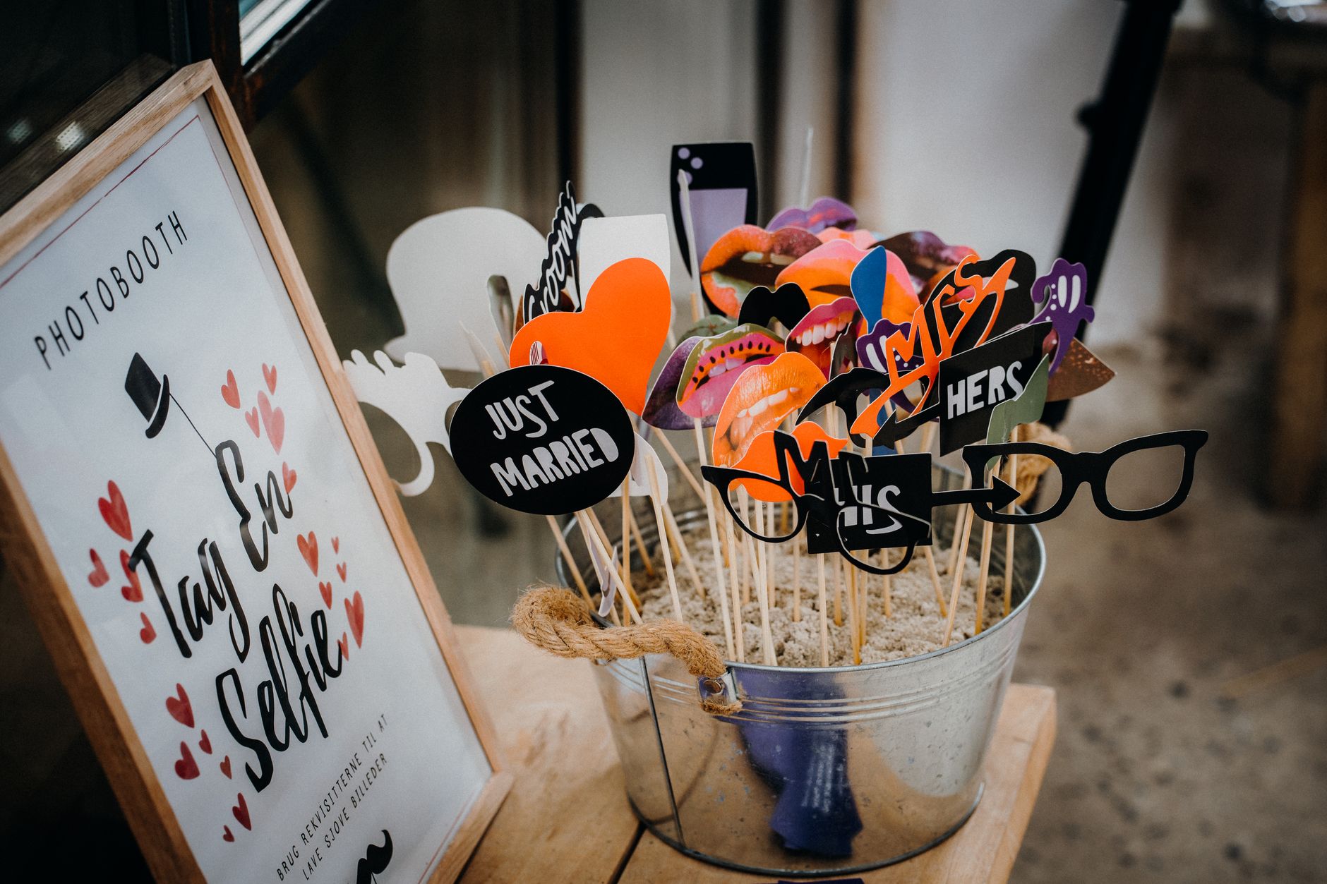
A wedding photo app sign is the small card or placard couples put on tables or near the entrance, asking guests to download an app and use it to capture the day. On the surface it looks like a simple instruction, but it is really asking guests to make three decisions at once: whether to participate, how to behave with a camera around other people, and what happens to the images once they're taken. Most signs answer the first question clearly and leave the other two implicit.
The reader question behind a search like this is rarely 'how do I make the sign look nice.' It's closer to 'what am I agreeing to, and what should I watch out for, before I start snapping photos of people at someone else's wedding.' That's a fair question, because a photo app sign is a lightweight form of consent request, and consent requests work best when they're specific rather than decorative.
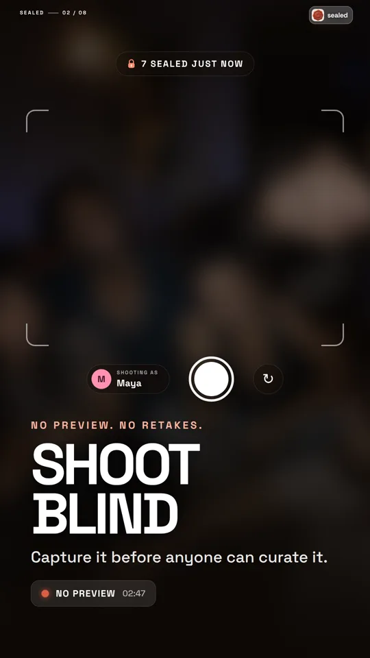
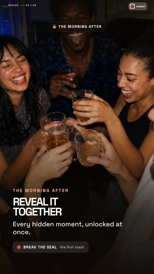
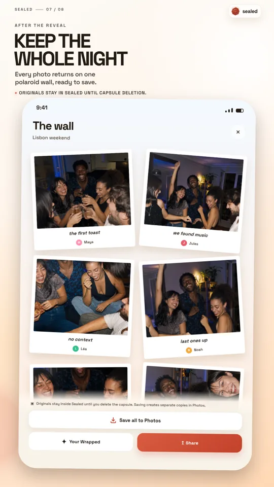
Some apps built around weddings are structured to shape behavior in ways a generic camera roll doesn't. Sealed, for example, is built around a delayed, shared reveal: everyone shoots, nobody peeks, and the group opens the results together later. That structure changes what a sign for it needs to communicate, because guests aren't just being asked to take pictures, they're being asked to hold off on looking at them.
Why the timing model behind the app changes what the sign should say
Not all wedding photo apps work the same way, and a sign that doesn't reflect the underlying timing model can mislead guests. An app with instant previews invites different behavior than one built around a delayed reveal. If guests expect to see and share photos immediately but the app withholds them until a set moment, confusion and frustration are likely, especially from people checking their phones mid-reception.
This is where minimal interruption matters as a design goal, not just a nice phrase. A sign that tells guests 'shoot away, we'll all see everything together later' is doing real work: it's setting an expectation that keeps guests present at the event instead of pulled into scrolling and comparing shots in real time. That's arguably the more valuable function of the sign, more than the download instructions themselves.
Couples choosing this kind of app should treat the sign as part of the experience design, not an afterthought. A one-line explanation of the reveal timing, placed where guests will actually read it, does more to align expectations than a longer paragraph of app instructions.
The consent question a sign can't fully solve on its own
A sign at the entrance or on a table cannot obtain individual, informed consent from every person who might end up in a photo. It functions more as a general notice: photography is happening, here's the tool being used, please participate thoughtfully. That's useful, but it isn't the same as asking someone directly before photographing them up close, especially in a candid or unguarded moment.
People should have consent before photographing or sharing identifiable participants, and that responsibility sits with each guest holding a phone, not with the sign itself. A sign can prompt awareness, but it can't verify that a guest checked with a stranger at another table before capturing them mid-laugh. This gap is worth naming plainly rather than glossing over, because it's the part most photo-app-sign advice skips.
Couples can help by adding a short line to the sign or verbal announcement acknowledging that some guests may prefer not to be photographed, and inviting those guests to say so. It's a small addition, but it shifts the tone from 'everyone is fair game' to 'we're asking for thoughtful participation,' which fits better with the idea of a shared, considerate ritual rather than a photo free-for-all.
A worked example: drafting a sign for a reveal-style app
Here is a hypothetical, for illustration only, of how a couple might draft a sign for an app built around delayed group reveal rather than instant sharing. This is not a template pulled from any customer or study; it's a way of thinking through what such a sign needs to cover.
Example draft: 'Capture the day with us - scan to join. Snap as many moments as you like; nobody peeks until we open them together at [time/moment]. Please be considerate of guests who'd rather not be photographed.' That's three sentences covering the call to action, the reveal mechanic, and a consent nudge, in roughly the space most signs already use.
The couple could then decide where to place it: entrance table for the download link, and maybe a repeated shorter version near the bar or dance floor as a reminder late in the night when people forget the rules they read hours earlier. This kind of repetition matters more than sign design, since guests rarely reread instructions once the event is underway.
- State the reveal timing clearly if the app delays photo sharing
- Add one line inviting guests who prefer not to be photographed to say so
- Repeat the core instruction somewhere guests will see it later in the event
- Avoid app jargon; describe the behavior expected, not just the download step
Limits worth keeping in mind before relying on a sign or an app
A photo app sign, however well written, doesn't replace judgment. It can't anticipate every situation - a guest uncomfortable being near cameras at all, a child whose parents didn't want photos shared, a moment that felt private even in a public room. No sign fully substitutes for people paying attention to each other.
It's also worth being cautious about what any wedding-photo app promises about interface language, listing availability, or feature details at a given moment. Editorial descriptions of a product, including this article, don't guarantee that the app, its store listing, or its support are available in the same language a couple might expect; anyone relying on those details should check the current listing directly rather than assume it matches what's described elsewhere.
Finally, a sign is a communication tool, not a legal release. Couples with specific concerns about photo rights, minors, or a public event with press or vendors present should think through those situations separately rather than assuming a casual sign covers it.
Bringing it together: what to check before you put up a wedding photo app sign
Before finalizing a wedding photo app sign, it helps to walk through a short checklist rather than relying on instinct or a template found online. The goal is a sign that sets honest expectations, nudges considerate behavior, and matches how the chosen app actually works.
This matters most for apps oriented around shared anticipation and thoughtful reveal, where the sign's job is partly to explain a timing model that differs from the instant-sharing apps most guests are used to. Getting that part right does more for the day's atmosphere than any wording choice about fonts or design.
- Does the sign explain when and how photos will be visible, not just how to take them?
- Does it include any acknowledgment of guests who may not want to be photographed?
- Is it placed and repeated where guests will actually see it during the event, not just at arrival?
- Have you confirmed current app details (language, listing, support) directly rather than assuming?
Frequently asked questions
Does a wedding photo app sign count as getting consent from guests to be photographed?
Not fully. A sign is a general notice that photography and an app are part of the event; it doesn't replace the more direct, person-to-person consent that's appropriate before photographing or sharing images of identifiable individuals, especially in candid or close-up moments.
What should a sign say differently for an app with a delayed, shared reveal instead of instant photo sharing?
It should clearly state that photos won't be visible right away and explain when the group will see them together, since guests used to instant sharing may otherwise expect to view or share images immediately, leading to confusion during the event.
Can I assume a wedding app's language or store listing matches what's described in an article or guide?
No. Editorial descriptions of an app's language or interface don't guarantee the same availability in the app itself, its store listing, or its support; it's best to check the current local store listing directly before relying on that detail.
Sources and further reading
These resources provide the wider reference frame. Product statements on this page are limited to the public information provided by Sealed.